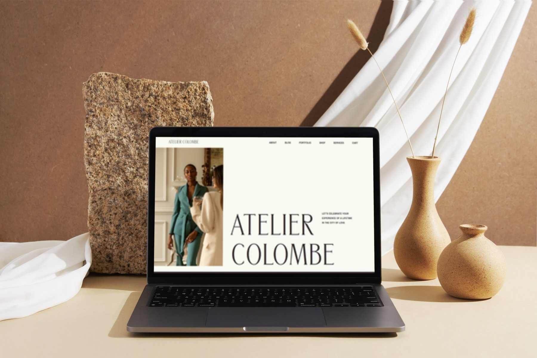
Atelier Colombe
Parisian Photography Studio
- Full Custom Website Design --
Why I built this projectAs part of the Standout Squarespace course, I created the Atelier Colombe website to stretch my craft even further - blending elevated visual storytelling with strategic structure and intentional custom coding. The goal was to design a site that feels luxurious and editorial, yet remains warm, welcoming, and easy to navigate.
This project allowed me to refine my process, tackle more complex layouts, and deepen my understanding of accessibility-first design and advanced Squarespace styling.
The aesthetic direction
Atelier Colombe embodies:
timeless, Parisian-inspired elegance
soft editorial typography
rich, earthy colour tones
curated negative space
a high-end visual rhythm across every page
I wanted the site to feel like stepping into a beautifully styled studio: grounded, artistic, and quietly confident.
Who it serves
The concept was built around a fictional boutique photography studio - giving me space to design for a brand that prioritises craft, emotion, and storytelling. This helped me demonstrate how my design style adapts seamlessly to creative, luxury, and experience-led businesses.
-
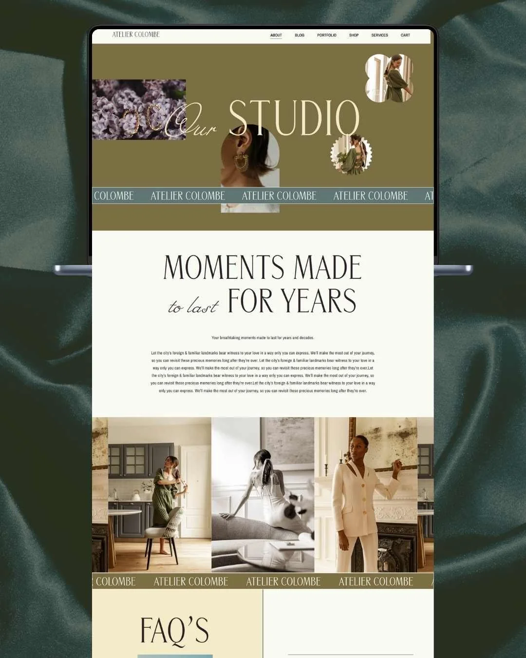
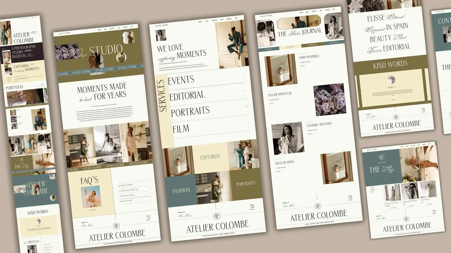
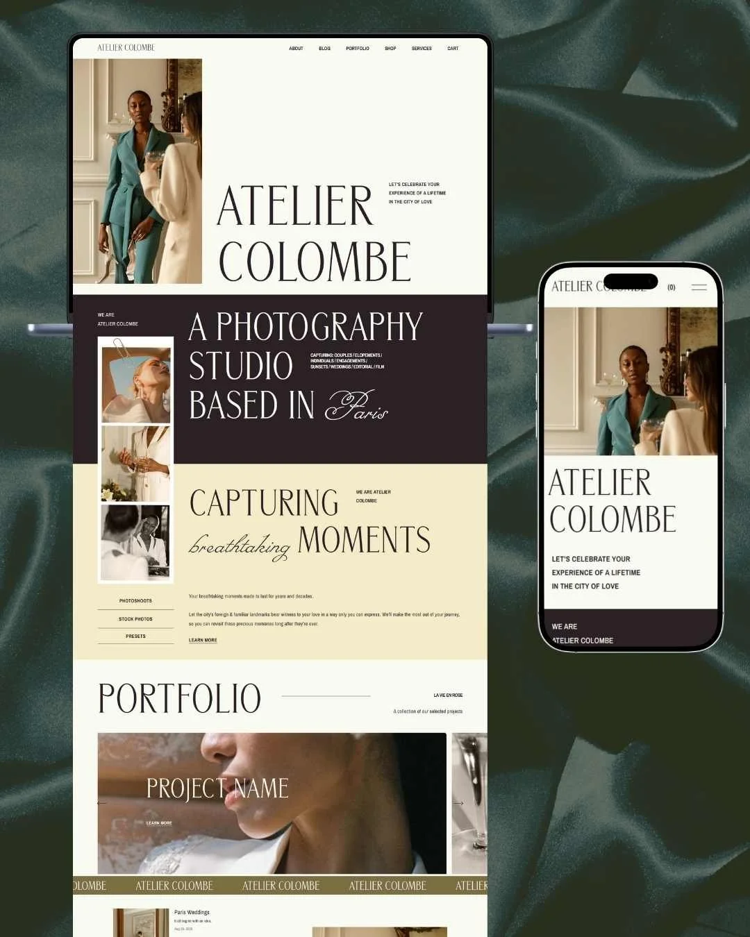
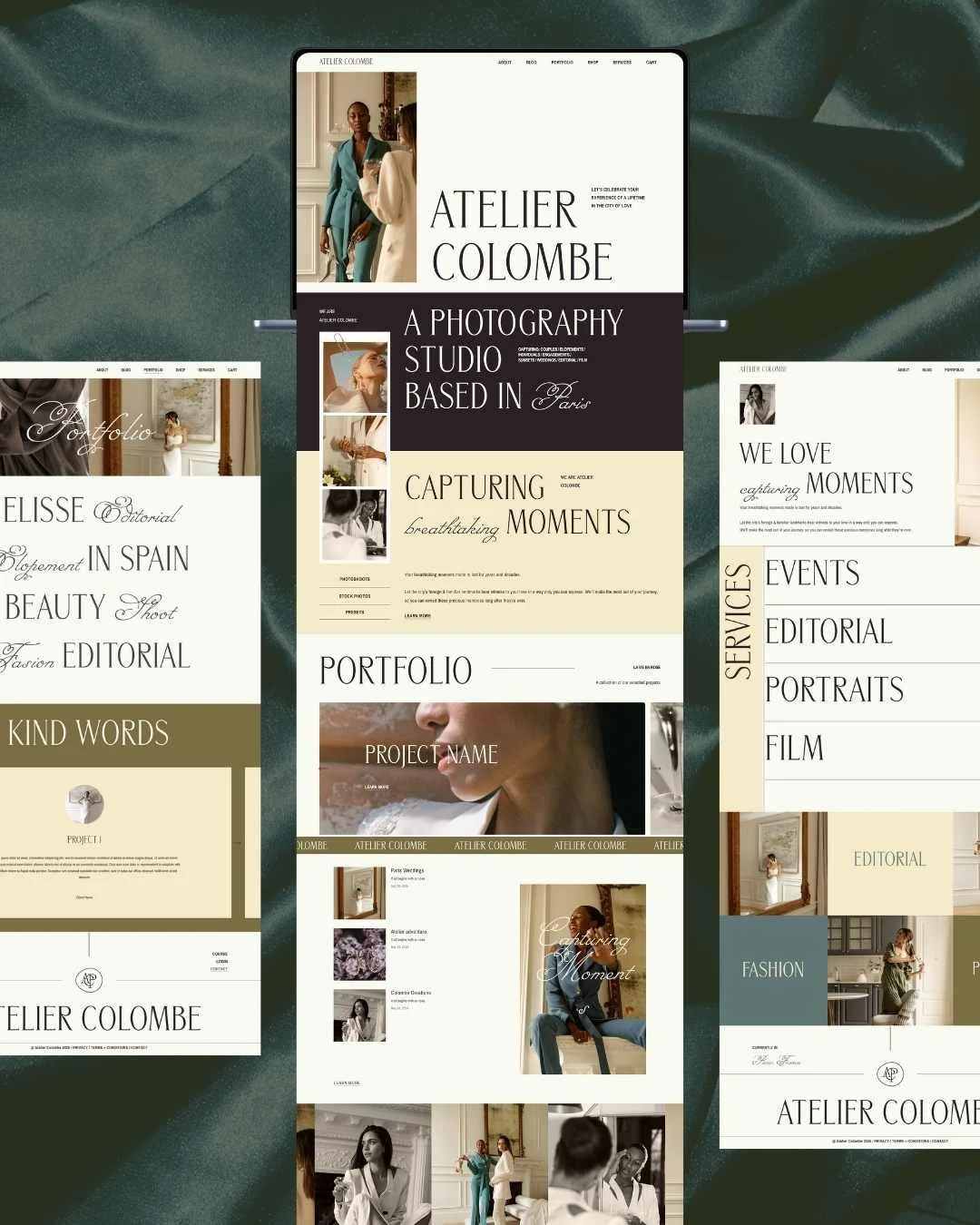
A thoughtfully structured experienceI approached the site with a clarity-first mindset, shaping each page around a natural narrative flow. Visitors are guided from introduction to portfolio, services, testimonials, and finally to the contact areas - mirroring the way a high-end client journey unfolds in real life.
Page-by-page strategy included:
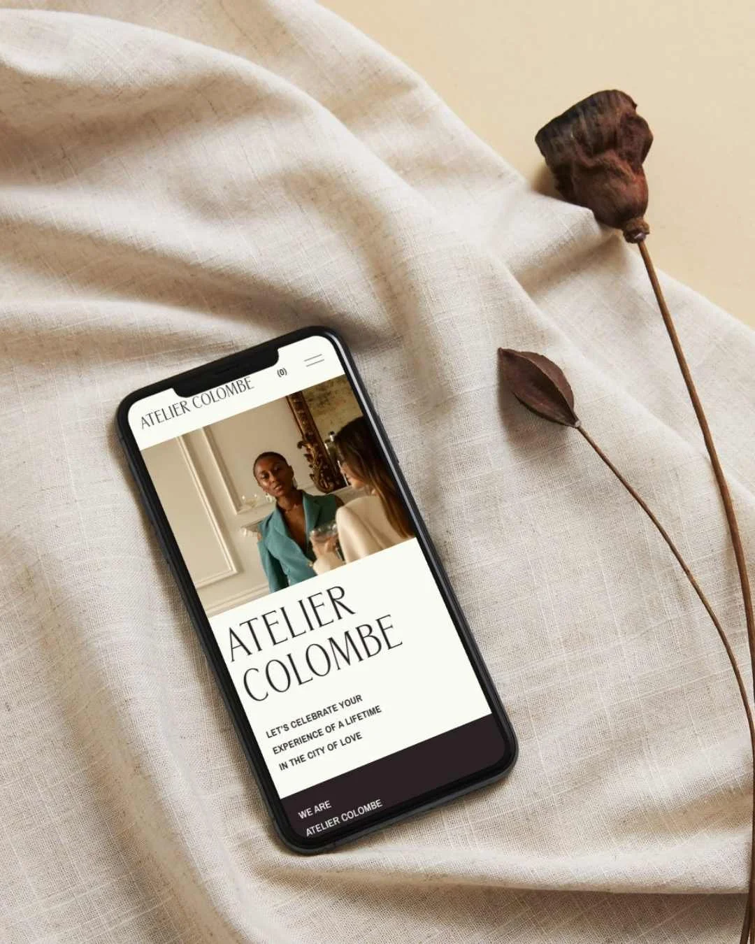
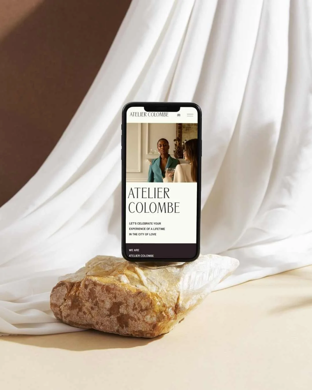
Hero sections with layered imagery and expressive type to set an editorial tone
Portfolio layouts designed to feel immersive while staying lightweight and user-first
Blog categories styled elegantly to showcase longer-form storytelling
Service pages with clean accordions for easy scanning and accessibility
Shop layouts created to be visually rich while maintaining simplicity for the user
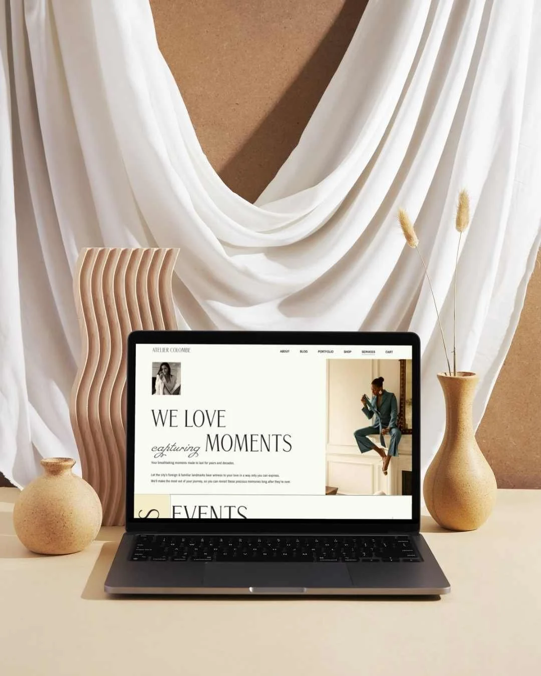
A deliberately modern typography system
This project challenged me to combine sophisticated serif fonts with fluid script details - achieving a balance that feels artistic but never chaotic. Consistent hierarchy ensured accessibility across all devices.
Design as emotion
Everything, from image placement to colour overlays, was chosen to convey nostalgia, warmth, and understated luxury. The aim was to create a site that doesn’t just display images, but evokes a feeling.
-
Showcasing my technical skillsThis project allowed me to demonstrate the kinds of intentional, standards-aligned enhancements I bring to every build. Throughout the site, I implemented custom code to refine the aesthetic while keeping the experience accessible and lightweight.
Key technical elements included:
custom CSS to elevate typography, buttons, and layouts
creative section dividers and horizontal scrolling marquees
image treatments that remain fully responsive
accessibility-forward adjustments to headings, contrast, and navigation
intentional interactions that enhance usability, not distract from it
a carefully optimised mobile experience, respecting touch and readability
Built with performance in mind
I designed the site using:
compression-friendly imagery
optimised fonts
minimal scripts
aligned metadata and SEO-ready structure
The result is a high-end aesthetic built on clean foundations - one that loads quickly, performs well, and feels effortless to use.
Reflecting my ongoing commitment to growth
The Standout Squarespace course encouraged me to work at a deeper creative and technical level. This project is a proud marker of my continued growth: blending creativity, strategy, and accessibility to deliver a polished, editorial-grade site experience.