Ashford Assessments
Specialist leadership assessments that help organisations make confident, evidence-based decisions.
- Full Custom Website Design --
Understanding the briefJosie approached me after attempting to build her own website with the help of a friend, but the result did not reflect the credibility, clarity, or professionalism her consultancy required. As a Chartered Psychologist working in leadership assessment, it was essential that her online presence communicated trust, expertise, and a sense of calm authority. My role was to bring structure, strategy, and visual alignment to her brand so the website could support the weight of her reputation and the significance of her work.
Shaping the direction
We began by refining her message. Together, we clarified what distinguishes her approach, how her assessments support decision-making, and what leaders need to understand before working with her. The foundational strategy focused on simplicity, transparency, and integrity so that visitors could immediately grasp the value of her services without feeling overwhelmed by the complexity of psychological assessment.
Visual grounding through the name Ashford
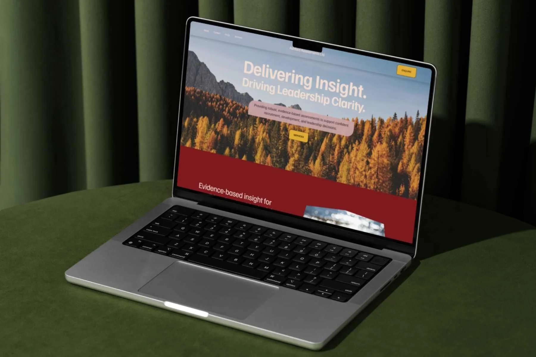
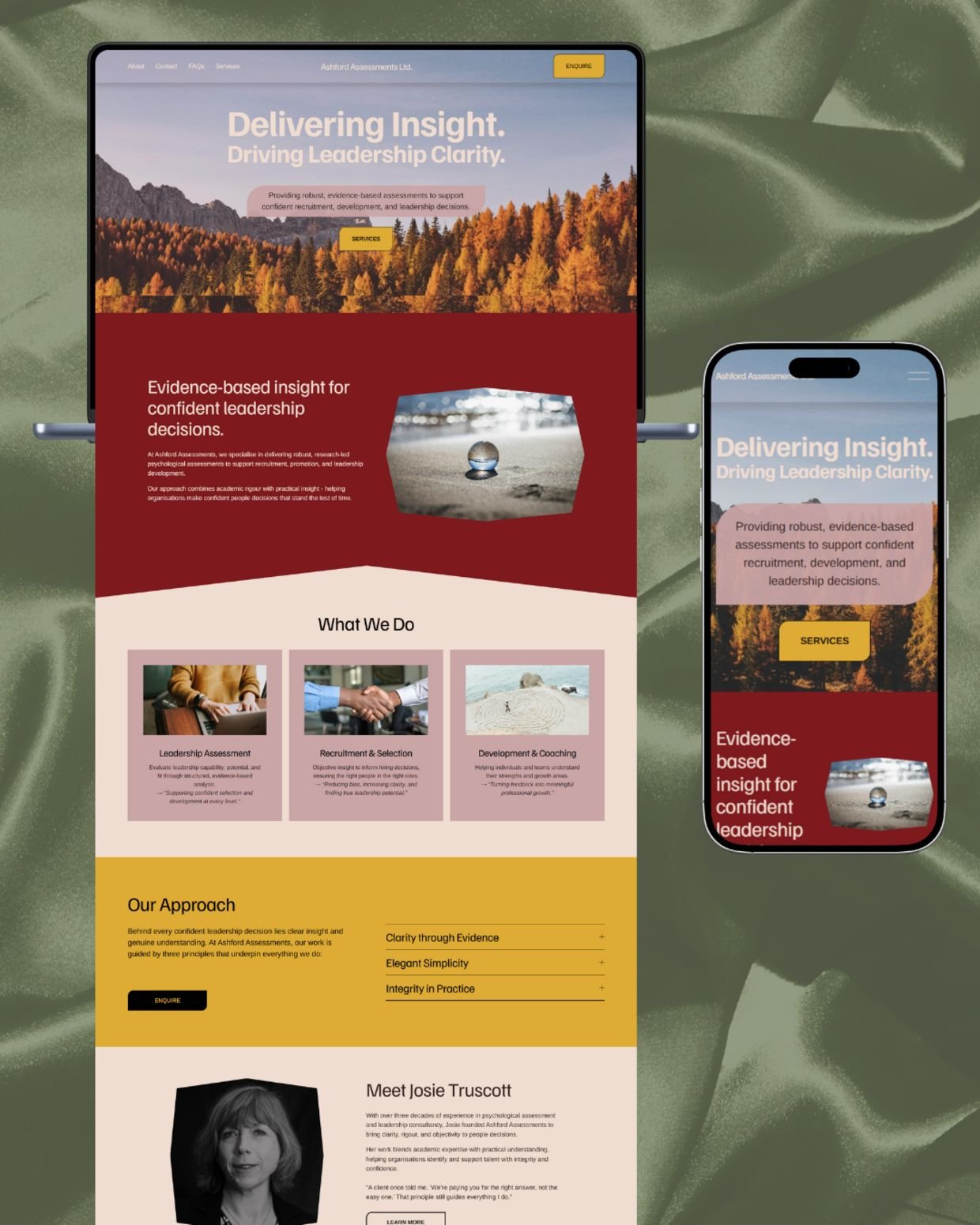
The visual identity grew directly from the name Ashford. We explored the meaning of Ash and Ford, drawing inspiration from ash trees and flowing water. Ash trees symbolise wisdom, resilience, and growth, while water represents clarity, movement, and insight. These ideas shaped the imagery across the site, weaving in nature throughout the design to reflect Josie’s calm, reflective, and evidence-led style of working. The result is a visual experience that feels grounded, thoughtful, and connected to her principles.
A digital presence that reflects her values
The strategic aim was to create a website that feels professional without being clinical, warm without being informal, and confident without being overwhelming. Every choice from layout to tone to imagery supports the same intention: helping visitors feel informed, reassured, and ready to take the next step in a meaningful conversation about their organisation’s leadership needs.
-
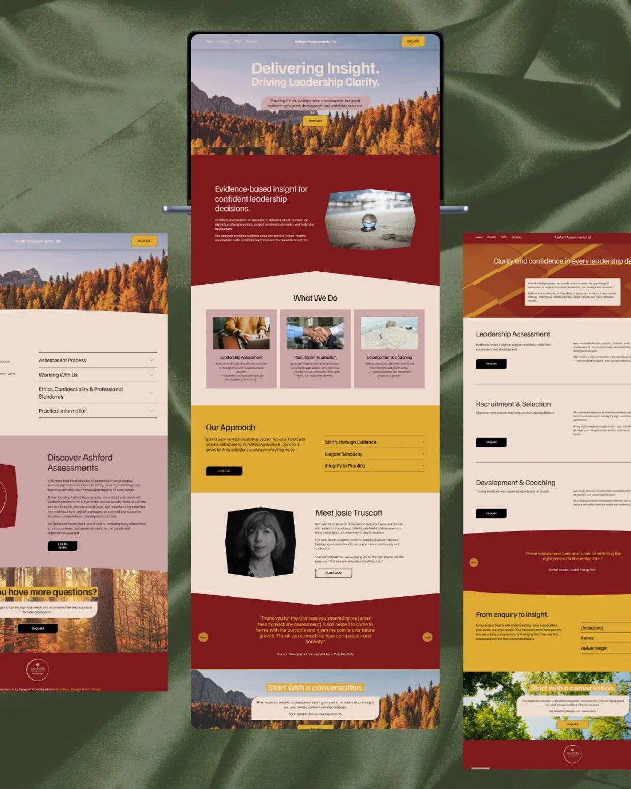
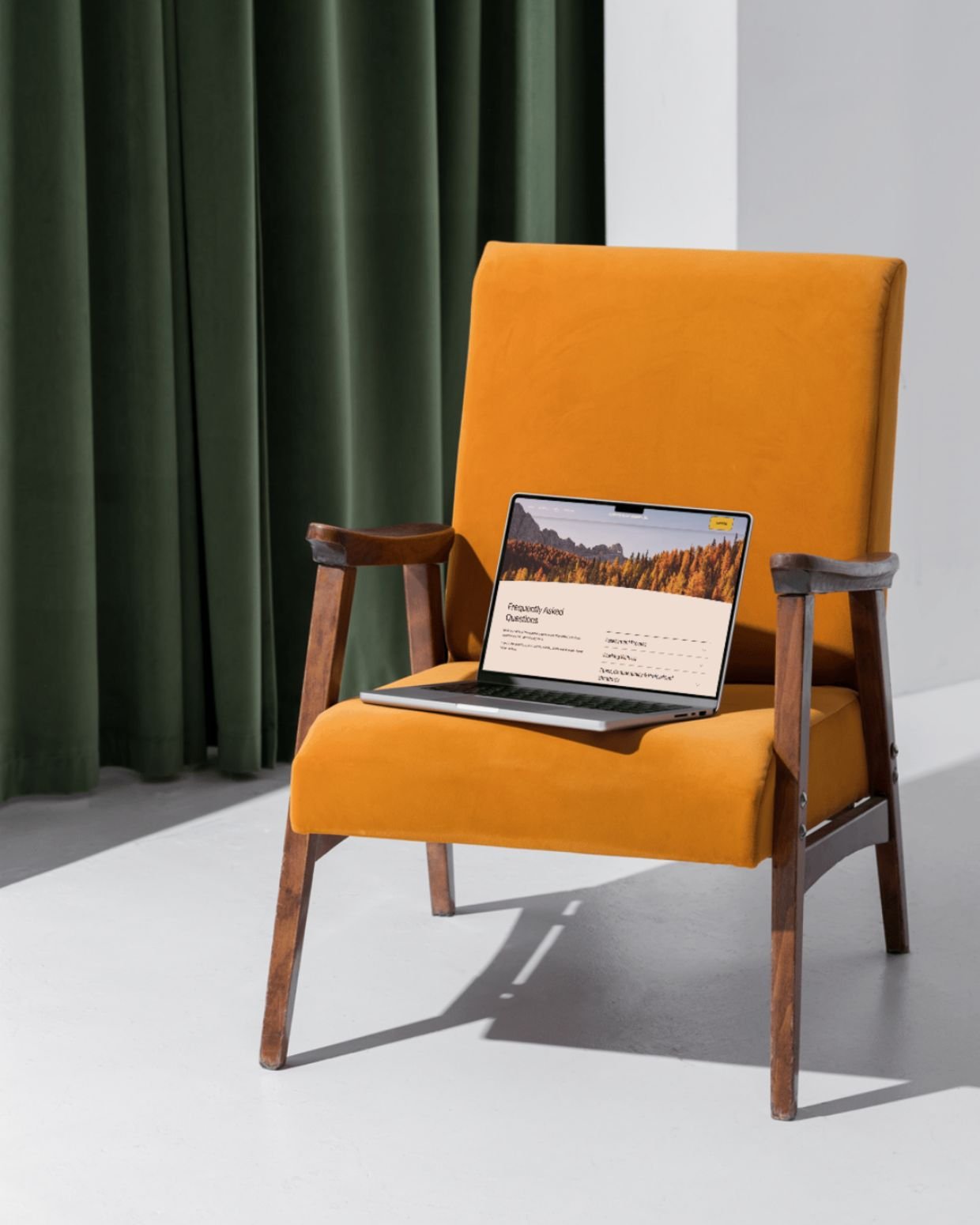
A clarity-first layoutEvery page was designed with Josie’s audience in mind - senior leaders navigating high-stakes decisions. The site needed to communicate trustworthiness and professionalism, while remaining warm, simple, and intuitive.
Key UX choices included:
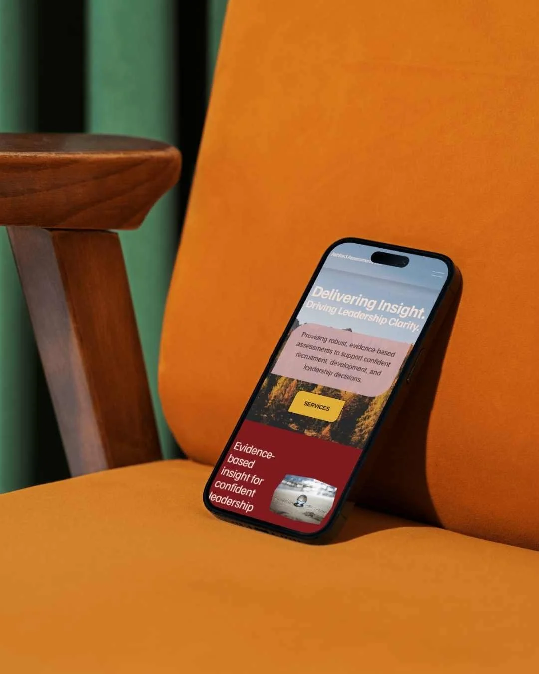
strong hero messaging paired with calm, expansive visuals
structured content sections that explain complex work with simplicity
clear service pathways that guide visitors to the right assessment
purposeful use of space to support readability and accessibility
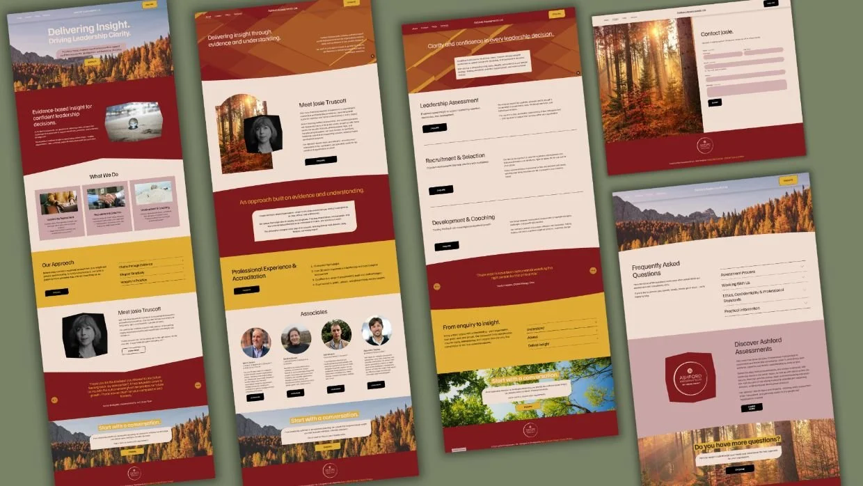
Page-by-page refinement
I shaped each page around a natural narrative:
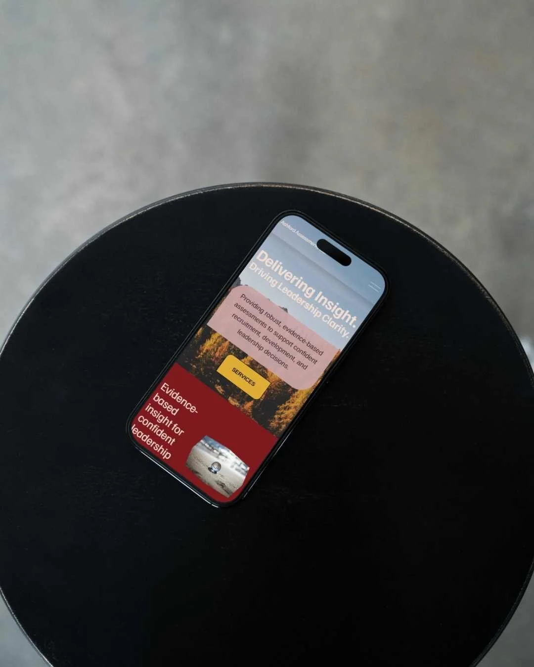
Home: sets the tone with warmth, expertise, and immediate clarity
Services: breaks down her offering into evidence-based, easy-to-digest sections
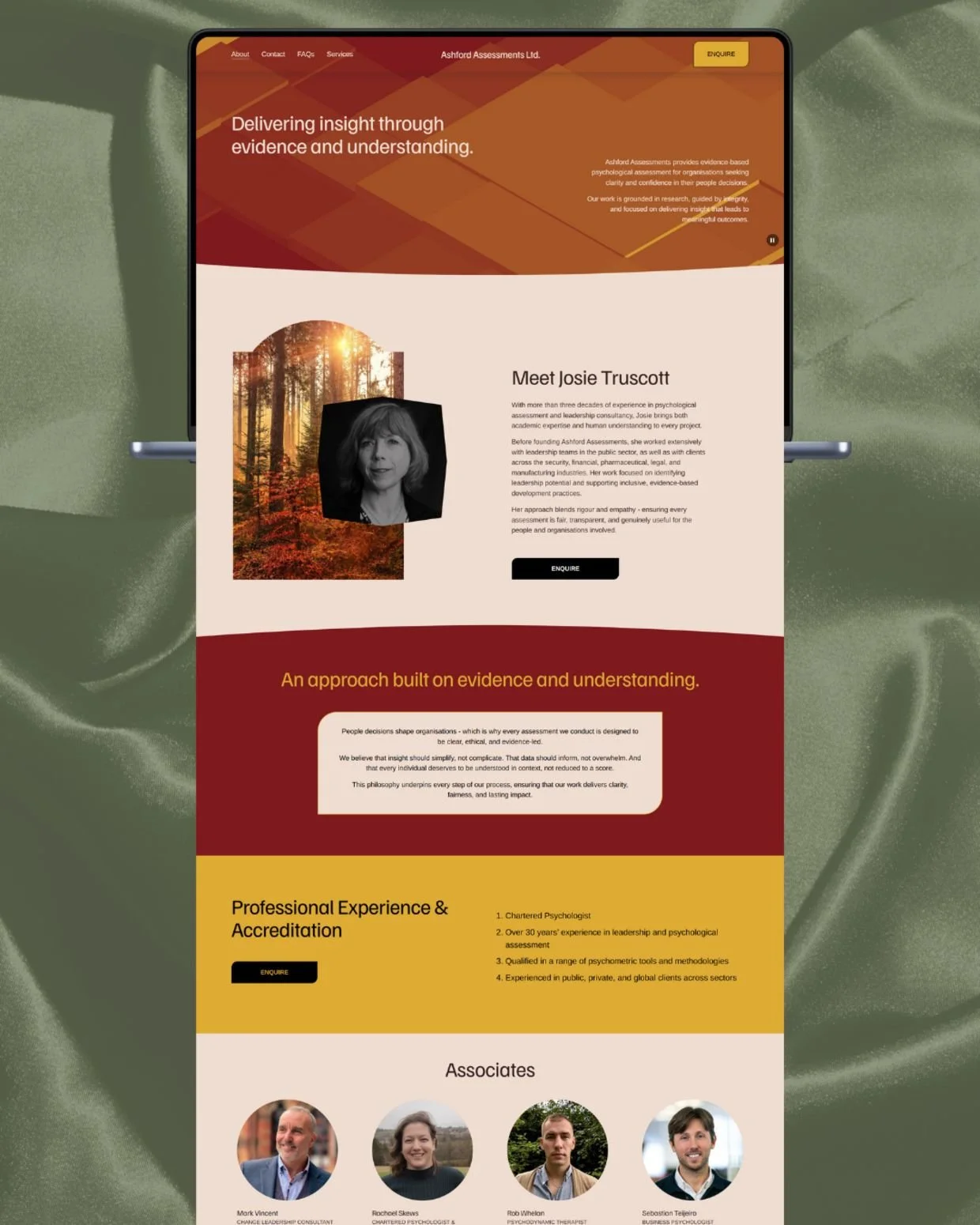
About: positions Josie as an expert with both academic rigour and human understanding
FAQs: reassures potential clients and reduces friction before enquiry
Contact: clear, efficient, and designed to build trust at the final step
Bringing the brand to life
The colour palette - deep reds, warm golds, soft neutrals - was chosen to feel grounded, confident, and professional. Typography choices enhance integrity and clarity, reinforcing her evidence-led practice while remaining accessible and visually gentle.
-
Full custom Squarespace buildAshford Assessments was built entirely on a bespoke Squarespace framework, using:
custom page layouts
responsive styling
intentional spacing and typography scaling
accessible contrast levels
a structured navigation system for a frictionless user journey
Technical enhancements included:
custom CSS for more elegant visual hierarchy
tailored accordion components
optimised image loading for performance
SEO-ready structure and page metadata
clear calls-to-action throughout the site
A collaborative process from start to finish
This project was a true partnership. I supported Josie through:
refining her messaging
curating a cohesive brand narrative
selecting imagery that conveyed her values
shaping complex content into simple, elegant journeys
The result is a website that reflects the integrity of her work, the depth of her experience, and the clarity she brings to organisations - all wrapped in a polished, professional design she can confidently share with clients.
A site designed to grow with her
The final build is flexible, scalable, and easy for Josie to update as her consultancy evolves. It reflects not only where her business is now - but where it’s heading.