5 Website Mistakes That Are Costing You Dream Clients

Your website is one of the most powerful tools in your business. It can showcase your work, build trust with your audience, and help dream clients decide you’re the one for them.
But here’s the hard truth: many women entrepreneurs are losing out on opportunities simply because their website isn’t doing its job.
It’s not about how talented you are or how brilliant your services may be. If your website isn’t strategically designed, it can quietly turn away the very people you’re trying to attract.
In this post, I’m sharing five of the most common website mistakes I see creative women making, and how you can fix them to start attracting aligned clients with ease.
Mistake 1: Your Messaging is Muddy
A beautiful website won’t matter if your words aren’t clear. When someone lands on your homepage, they should know within seconds:
Who you are
What you do
Who you do it for
Why it matters
Too often, websites focus on being clever or creative at the expense of clarity. If your visitor has to work hard to figure out what you actually offer, they’ll leave.
The Fix:
Start by tightening your message. Think about what your dream client needs to hear to feel understood. Write headlines and copy that answer their questions before they even ask them.
Mistake 2: Your Site Lacks Flow
Websites are like stories. Each page should guide your visitor to the next step in the journey. Without flow, your website feels confusing or incomplete.
Common signs of poor flow include:
Dead-end pages with no clear call to action
Overwhelming navigation menus
Random layouts that don’t build trust or tell a story
The Fix:
Map your site like a journey. For most service-based businesses, this looks like:
Homepage → About → Services/Offers → Proof (portfolio/testimonials) → Contact/Booking
Every page should lead somewhere and gently guide your visitor to take the next step.
Mistake 3: It Looks Like Everyone Else’s
If you’ve ever used a generic template without making it your own, you know how easy it is to blend into the crowd. Your website should feel like a true reflection of you and your brand, not a copy-and-paste version of someone else’s.
When your site looks generic or misaligned, potential clients subconsciously wonder if your services will feel generic too.
The Fix:
Choose visuals, colours, fonts, and images that actually represent your brand values and personality. If you’re using a template, customise it with your own brand styling so it feels intentional, not cookie-cutter.
Mistake 4: You’re Talking About Yourself Too Much
Your website should be about your client, not just you. Yes, your story matters, but the person scrolling wants to know what’s in it for them.
If your copy is full of “I” and “we” without enough “you,” your visitor might struggle to connect.
The Fix:
Shift the focus. Instead of saying “I build Squarespace websites,” try “I help ambitious women entrepreneurs create websites that attract clients and elevate their brand.” The difference is subtle but powerful - it positions your client as the hero, with you as the guide.
Mistake 5: There’s No Clear Call to Action
You’d be surprised how many websites forget to actually tell people what to do next. Whether it’s booking a consultation, purchasing a template, or downloading a free guide, your site needs to make the next step clear.
Without a call to action, visitors leave without taking action, even if they loved what they saw.
The Fix:
Every page should end with a clear, intentional call to action. “Book your consultation,” “Explore templates,” or “Download the Website Glow-Up Guide.” Make it simple, make it visible, and don’t leave people guessing.
Final Thoughts
Your website has the power to build trust, attract aligned clients, and move your business forward. But only if it’s designed with clarity, strategy, and flow.
By avoiding these five common mistakes, you’ll not only create a site that looks beautiful but one that works beautifully too.
Ready to Fix Your Website?
Start with clarity: Download my free Website Glow-Up Guide to get practical prompts and design tips that will transform your site into something you’re proud to share.
DIY with confidence: Explore my Squarespace template, designed for purpose-led women who want a site that feels polished and strategic without starting from scratch.
Want a full transformation? Book one of my custom design packages to take the pressure off and finally have a website that truly reflects you.
- Amy
Hey - I’m Amy! Designer, book lover & crochet addict - helping women-led brands bloom online.
Join the List
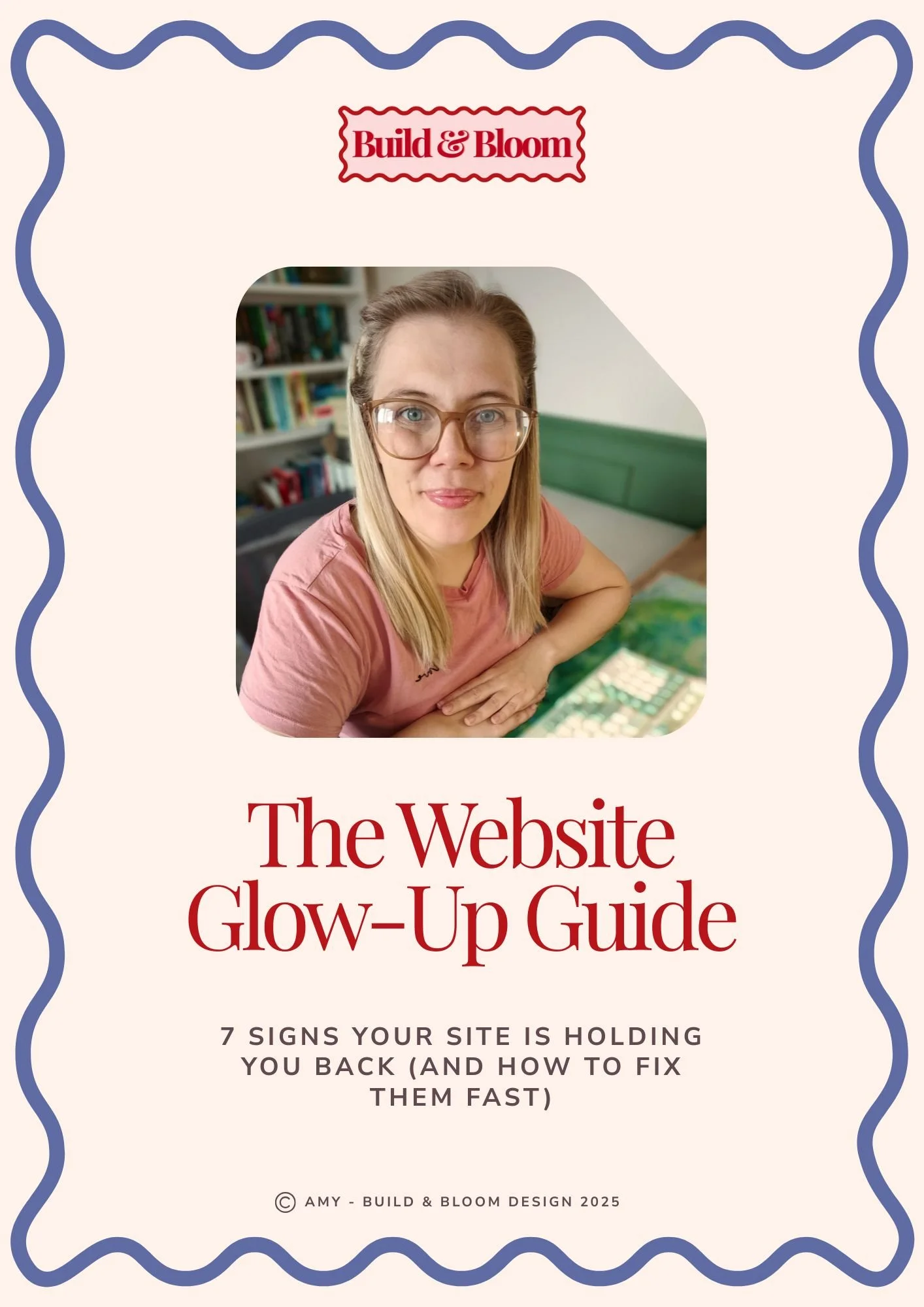
Grab your free copy of The Website Glow-up Guide!

Head over and explore the Aster template! Full demo site available.